
Is the Pantone Color of the Year 2026 “Cloud Dancer” or is it just… white?
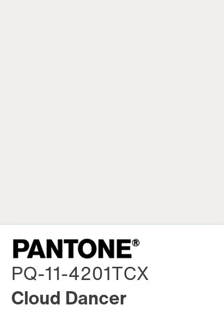
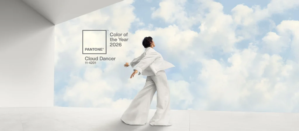
Pantone’s Color of the Year 2026 is Cloud Dancer (PANTONE 11-4201), a very soft, airy white, and yes, the internet immediately went, “Congrats on discovering printer paper.” The controversy is basically this, it’s intentionally near-white, and Pantone framed it as a calming “blank canvas” moment for a noisy world.
Key takeaways
- It’s official, Cloud Dancer is Pantone’s 2026 Color of the Year, announced Dec 4, 2025.
- White can absolutely be “a color,” both in science and in design practice.
- The real value is practical, it’s a pairing powerhouse, but you still need strategy so it won’t look sterile.
- Treat it like a creative prompt, not a creative prison, that’s the healthiest way to use these trend calls.
Quick answer, is Cloud Dancer “real,” and why are people mad?
Yes, Cloud Dancer is the official Pantone Color of the Year 2026, and it’s labeled PANTONE 11-4201.
People are mad for three reasons:
It looks like “just white,” so it feels lazy at first glance.
White has cultural and political baggage, so some readers see the choice as tone-deaf or provocative.
Some suspect it’s controversy-as-marketing, because rage travels faster than taste.
My take, the backlash is understandable, but the “it’s not a color” argument is the weakest one. White is a color, it’s just a high-maintenance one.
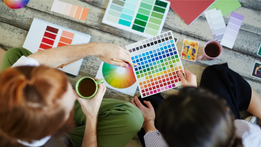
Pantone 101, who they are, and why anyone listens
Pantone is basically the world’s most widely recognized color standard language for design, manufacturing, and print workflows. Their big revolution was the PANTONE MATCHING SYSTEM, launched in 1963, which made it far easier for different teams and vendors to reproduce the “same” color consistently.
Ownership and industry context matters too. Pantone was acquired by X-Rite in 2007 (yes, color tooling is serious business).
If you’ve ever said “That blue is the brand blue,” you’ve used the idea Pantone sells, a shared reference point.
The Pantone Color Institute, what it does (and what it doesn’t)
The Pantone Color Institute is Pantone’s trend and consulting arm, the group that frames color choices as cultural signals and design direction. For Color of the Year, they position the pick as a reflection of mood and movement across industries like fashion, interiors, product design, tech, and media. Smithsonian Magazine
Important reality check, they’re not passing laws of nature. It’s an influential forecast, not a divine commandment.
Why Pantone chooses a “Color of the Year,” history and purpose
Pantone’s Color of the Year program started in 1999, originally described as a way to engage the design community and color enthusiasts in a wider conversation about color and culture.
The point is twofold:
- Signal a direction: “This kind of mood is rising.”
- Give creatives a shared reference: so brands, designers, and manufacturers can riff on the same idea across markets.
Also, it’s marketing. Useful marketing, sometimes a bit theatrical marketing, but still marketing.
So what exactly is “Cloud Dancer,” and why pick this white?
Cloud Dancer is PANTONE 11-4201, described (by Pantone and outlets quoting them) as a “lofty,” “billowy” white meant to suggest calm, clarity, quiet reflection, and the mental space to make new ideas.
Pantone’s leadership framed it as a “blank canvas” and a “fresh start” vibe, basically “less noise, more intention.”
And yes, it’s the first time Pantone has picked a white as Color of the Year.
Is white a color, or is the internet correct and it’s “nothing”?
White is a color in multiple legit ways, and technically, if you ask Newton, it kind of is all the colors!
- In light, white can be produced by combining many wavelengths (the classic “all the lights on” concept).
- In design, “white” isn’t one thing; it’s a family. Warm white, cool white, chalky white, creamy white, paper white, and now, “Cloud Dancer white.”
Why do people argue about it then? Because near-neutrals are where your eyes play tricks on you.
The “it looked white yesterday” problem (metamerism)
Two whites can match under one light source and drift apart under another. That phenomenon is called metamerism, and it’s especially common in neutrals and near-whites.
Practical implication, if you’re using Cloud Dancer in interiors, print, packaging, or textiles, test it in the lighting where it will live, not just under your desk lamp.
Cultural meaning check, white is not “neutral” everywhere
If you’re writing for the US and Europe, white often reads as clean, modern, minimal, sometimes bridal or “new.”
In Japan, white can signal purity in Shinto contexts, but it can also connect to death symbolism historically, while modern funeral attire is typically black. That’s why white messaging can land differently depending on context.
In Korea, white has deep cultural visibility too (including historical “white clothing” traditions), so “just white” can still carry identity and meaning.
If you’re a brand using Cloud Dancer globally, the move is simple, pair it with a clear concept (calm, clarity, craft, softness) so it doesn’t get interpreted as “blank” in the worst way.
How I’d actually use Cloud Dancer (without looking like a hospital)
1) Fashion, “expensive minimal” without the boredom tax
- Texture stacking: cotton, wool, satin, denim, knit. Cloud Dancer works when the materials do the talking.
- One sharp contrast: black accessories, deep navy, espresso brown, or a single bold color pop.
- One warm anchor: gold jewelry, tan leather, warm neutrals.
2) Home and interiors: airy, yes; sterile, no
- Use Cloud Dancer as the largest surface (walls, big furniture), then bring warmth with wood, linen, and warm light.
- Avoid “all glossy everything,” matte and eggshell finishes usually feel calmer.
- If you’re unsure, pair it with one “human” element, plants, woven baskets, ceramics.
3) Branding and UI, make it usable and accessible
Near-white backgrounds are great, but don’t sacrifice readability. WCAG guidance for normal text commonly targets 4.5:1 contrast minimum, so pure-light-on-light layouts can become a legibility trap.
4) Beauty and nails, the clean-girl shortcut
Cloud Dancer reads strongest as “clean” when it’s not the only note, add pearl shimmer, translucent layers, or a micro-line detail.
Quick comparison table, Cloud Dancer vs “generic white” in real life
| What you’re comparing | What you’ll notice | The fix |
|---|---|---|
| Cloud Dancer vs pure bright white | Cloud Dancer tends to feel softer, less “paper” | Add warm materials, avoid cold LEDs |
| Cloud Dancer under daylight vs warm indoor light | Whites shift a lot with lighting | Compare samples in both conditions (metamerism is real) |
| Cloud Dancer on screen vs print/textile | Screen RGB is an approximation | Use Pantone references for production, proof early |
The “designer reality” sidenote, Pantone workflows got messier
If you do design work in Adobe apps, you probably remember the change where Pantone libraries stopped being bundled and Pantone Connect became a key path to updated libraries, starting around Nov 2022. Pantone’s own support pages describe this shift and the plug-in workflow.
This matters because it’s another reason people side-eye Pantone announcements, they’re trend setters and a walled garden.
My honest take (and the vibe I want you to walk away with)
I genuinely think “Color of the Year” is a fun cultural ritual. It’s like a New Year’s playlist, you don’t have to agree with it, but it can still set a mood. And yes, white is a color, it’s just one that forces you to be intentional, because it doesn’t hide lazy choices.
But I’m not treating Cloud Dancer like it’s a judge’s gavel. If you’re a creative, stay creative. Use it as a starting grid, then go invent your own race.
Frequently asked questions
Pantone positioned it as a calming “blank canvas,” reflecting a desire for clarity, quiet reflection, and mental space for new ideas.
In light and color science contexts, yes, and in design practice it’s definitely treated as a color family with many variants.
Use warmth and texture, wood, linen, matte finishes, warmer lighting, and one contrasting anchor color. Also test it under your real lighting, because whites shift dramatically.
Yes, but check contrast carefully. Accessibility guidance commonly targets at least 4.5:1 contrast for normal text, so avoid light gray text on near-white backgrounds.
It’s influential, but it’s still a trend forecast and a cultural conversation starter, not a rulebook. Use it if it helps you, ignore it if it doesn’t.